On the Same Page

This project was a finalist for the Service Design Award 2016 in the category: Non-profit/ Public sector, Student work.

Overview

During the Fall of 2014, Sykehjemsetaten, the Nursing Home Agency, in Oslo was beginning to restructure nursing homes. The Nursing Home Agency is the largest operator of nursing homes in Norway and the second largest municipal agency in the city of Oslo. In response to a mandate from the Department of Health, Seniors, and Social Affairs, 4 Health Houses were formed from existing nursing homes. These Health Houses would no longer accept long term patients. Instead, they would act as short term facilities focused on rehabilitation. The remaining 44 nursing homes in Oslo would in turn treat only long term patients, providing care until end of life. The division of short term and long term care would make it possible to proviede more efficient and effective care to Oslo’s aging population. 24 homes would be required to change their operational models, some already functioned as longer term care only. 

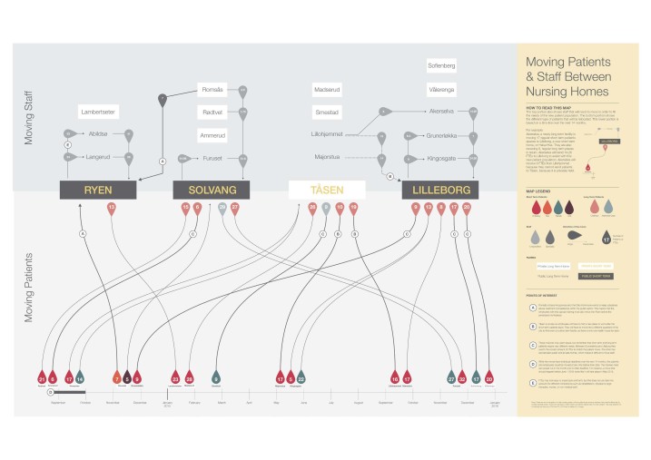
In practical terms, this change was a logistics problem. Patients, with their families’ consent, would be moved to different homes. Certain patient types need to have different staff-to-patient ratios and specialized facilties. Some patients waited to see where their favorite staff member was placed before deciding whether they wanted to move. This change would also require moving supplies, equipment, and personal belongings. 

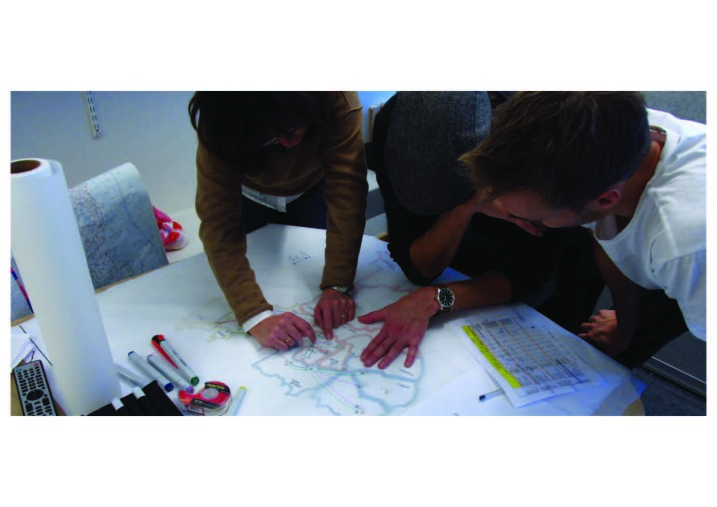
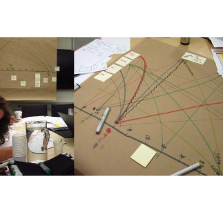
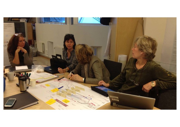
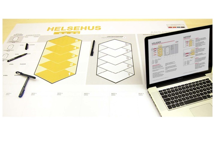
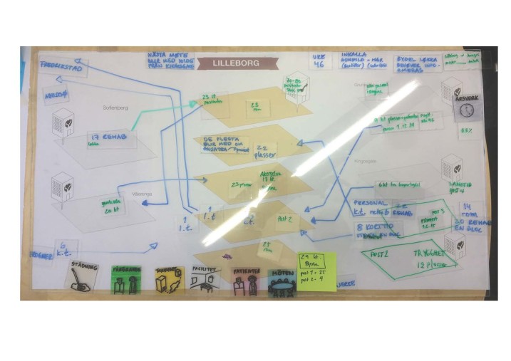
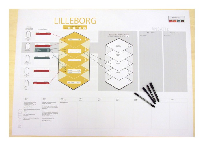
When we were introduced to this project, moving days were already being scheduled. The process for planning and managing them, however, was not ideal. Information was primarily held in spreadsheets that were difficult to understand and were often updated by handwriting on a printed version. Representatives from each of the four Health Houses would attend a series of meetings with each of the newly long term homes that they were assigned to exchange with. These assignments were based on geographical location within the city. Over the course of several meetings, they would agree with how many patients and staff, along with other equipment, would be moved. This was based on what district the patients came from, their medical needs, what floors or facilities they could be on, and other factors. These meetings were led by Bente Solberg Sæve, one of our main contacts throughout this project. Our other main contact was Bjørg Torill Madsen, Health House Director.

On the Same Page is a project about building common understanding through shared visual representations. Among other things, our primary deliverable was a communication tool. It was used not only to facilitate the meetings between homes, but to also to act as a reference point and a way to communicate the process to those who were not present, but were certainly affected by this change. 

PROCESS

Getting an Understanding

We began this project by conducting 11 interviews with verious stakeholders in the elder care system in Oslo. This gave us a great overview of the system and helped us to ask the right questions with the larger context in mind. We started to look at what the system would look like after the move, what potential there was for new services. When we presented our inititial idea to our partners, they were appreciative, but anxious. 

They were not looking for future projects and concept work. They needed help immediately. 

They were struggling to communicate the effects of the moves to employees, residents, and family members. They showed us their spreadsheets and asked for a designer’s perspective. 

Building an Overview

We spent several days in their offices. The City Overview Map shows the number and type of patients and employees moving between different homes. We charted these over a timeline of the next 16 months, so it was clear where they were in the process. We added notes about particularly challenging moves, so they wouldn’t get lost in the complexity. This map showed the whole restructuring from a very high level, and their response was overwhelmingly positive. They brought it to their annual budget meeting to explain what was going on with this project. 

The map was plotted on a large sheet and hung in the office to be used a common reference. We started to see it printed out on desks at different nursing homes. They used it to communicate with others in their department and across the city to show that there was indeed a plan and here is was it looks like. At this point we knew there was more we could do with visualization. This first map had a bird’s eye view, and was a good resource. But there was still so much to figure out. Which district’s will be moved to which floors of the new health houses? How many patients are coming at once? Are their families involved? Are there special medical needs like dimentia or substance abuse issues to consider? Can husband and wife stay together? These decisions would be made in the planning meetings between the individual homes. So we decided to attend one and see what more could be done.  

Creating Immediate Value

While sitting in one of the planning meetings, we started to illustrate the conversation, drawing out the floors in the homes. The drawing was part of visual notes we took. The meeting was difficult to follow without it. Participants each were sitting in front of their own notebooks, papers, and laptops. They often talked over each other or contradicted something that had already been agreed on. Eventually, participants in the meeting looked up and understood what we were doing. One person put their finger on the paper and started talking about a specific floor and group of patients. Immediately the conversation became much more clear. With one visual reference point, everyone got on the same page and could make decisions more easily. 

With one simple illustration we were able to add value to that meeting, helping it go more smoothly and efficiently. 

This is when we realized they needed help communicating not just to people outside these meetings, but there at the table as well. So we got to work making a new tool for them.

Prototyping in Real Time

We began attending as many meetings as we could. We had a limited amount of time to develop this tool and we didn’t want to set up extra prototyping sessions with fake numbers just to see if this might work. We sat in meetings that were already scheduled and worked with the actual people who would be using this. This method also helped to create ownership of this tool with them and get Bente and the planners comfortable with it. 

We brought the tool with us and looked for what worked, what needed tweaking, and what should just be removed. We updated the numbers and changed the layout after each meeting until we found something that worked. We focused on trying to support the natural flow of conversation that they had, not try to steer them somewhere else. 

Iterate Until It’s Ready

Over the course of several weeks, we developed the communication tool by responding to how the participants used what we presented. We made some assumptions and tried different ways of representing information until we landed on something that was clean, concise, and accessible. 

The first version of the communication is practically unrecognizable. We physically represented all the elements of the move: patients, staff, equipment, etc. We wanted to show in a very tangible way the physicality of the move. It was a disaster. The conversation moved too quickly for all that paper, and the pieces weren’t being moved. Instead, the participants of the meeting just talked to each other, without bothering to move things. In the next version, we simplified by writing the amount on a plastic chip, to decrease the number of items in use. We also realized the individual floors of the nursing homes were central to understanding the new arrangements.

We then put an acrylic sheet on top of the map to write on. We hoped that it would encourage participation because it’s easily erased. But it was difficult for everyone to write if they didn’t have the right marker and hard to update the numbers after a meeting without smudging it all. Though all the meetings took place in Sykehjemsetaten’s office space, it was also unrealistic to assume they would carry such a heavy board to other meeting locations in the future. 

After this we decided to go digital. We’d print a new version for each meeting, then write directly on the sheet and update the numbers afterwards. This got everyone writing and working together. By letting them write with whatever tools they felt comfortable with, a barrier was lowered and participation rose. 

We then added more structure to the maps to keep things organized and easy to see what was happening at a glance. We center the communication tool around one Health House. We also added other homes to the left. These homes were all exchanging with the same Health House and we didn’t want to accidentally move two different patients into the same spot.

We later added homes to the right of the Health House so we could understand what patients were moving out again. At first we thought about creating a back and forth pattern. After all, two homes were part of each meeting and there was an exchange. But we chose not to. Each meeting takes place between one Health House and one long term home. But the long term home appears on both sides of the map. It’s counterintuitive to have the same home represented twice on the same map, but we chose to show the moves in two stages rather than just back and forth because this reflected the natural flow of conversation. We didn’t want them to rethink this exchange because it looked better on paper. Lines in too many directions would also have complicated the process. We focused on the human beings that had to move in and out, rather than the stationary buildings. The way this tool was developed in partnership with the users made it easy for them to take control of it after we were done the project. During the first few tests, we were the ones facilitating the meetings, writing and moving the physical pieces. 

By chance, at the end of the semester, we dropped by their office and found them using the tool without us. It had become a natural part of their work; they didn’t need us anymore. 

 --

For the final version of the tool, we wanted a fresh pair of eyes. We were a team of four, and one designer had been updating the tool after each of the meetings. There wasn’t always time to do major overhauls for each version, and there were elements on the page that the team wasn’t using anymore. So before we handed them the final version, we switched roles and one of us who hadn’t been updating the files gave it a refresh. The elements were simplified and an overall hierarchy and structure was added to clarify. We also added colors to the different patient types that matched the original City Overview map, so it would be easy to check final numbers against it. 

Luckily, this worked out for two reasons. First, it made sure that every element on the page was useful and necessary. Secondly, it made it easier for us to pass on. We told Bente that we were planning on making a version in Powerpoint so she could update it herself after each meeting. But instead, she surprised us and asked what program we used originally. When we told her it was Adobe Illustrator, she suggested that if it wasn’t too hard, she could just learn it as they had the budget to buy it. The final version of the tool was tweaked one more time to encorporate straight lines and shapes that are easy to manipulate with only a few minutes training. 

The versions we gave to them at the end of the project contained meticulously labeled sections and layers. We locked certain layers in the background and color coded everything. We made a separate artboard with one blank version of every type size and style and every shape that was used on map. This made it easy for them to copy and paste what they needed, then edit the text when it needed updating. 

Output

There were several final deliverables for this project. The first and foremost of which is the analog communication tool. One large template was made, then customized to make one for each of the exhanges, 18 versions in all. We also included the digital files so they could be updated. In addition, we printed small versions of the tool and included them in a binder with instructions for how to update the template. 

Another important deliverable was the City Overview map. It became a constant companion in all the meetings. It has been used to communicate what the department is doing in both the long and short term. We also included for them a collection of all the insights we gathered during our initial research phase in a book. We felt these had been valuable for us and helped us gain perspective. It meant we didn’t have to ask entirely stupid questions, just naive ones. At the end of this project, we knew the Nursing Home Agency was working on another service design project and we wanted to provide a jumping off point for the next designers to come into this space. 

The final, and least tanglible deliverable for this project is a pair of workshops. The first took place inside a nursing home shortly before it transitioned into a Health House. We led the staff of several different homes through visualization exercises. We wanted to give them a space to voice concerns about what the concequences of this shift could be. We also encouraged them to suggest improvement projects of their own, things they would like to see change along with everything else. The second workshop was a larger event, with 50 healthcare professionals from all over Oslo. We placed them into ten diffferent groups and gave each group a patient’s journey to map. This exercise asked the groups to pull from their personal knowledge and expertise to build a common vision. Partway through the journey we added complications to the patients’ medical histories or a twist. They worked together and presented the journeys at the end of the session. 

Though these two workshops did not directly affect the meetings we were trying to facilitate between the homes, it was impactful. Our partners explained that it was a great way to get people talking about this massive shift in operational models. It got them working together and many participants told us they were happy they could put faces to so many people they had only met through office emails. These changes would not just affect the nursing homes, but also the hospitals and local health services within residential districts in Oslo. These workshops, though a small effort, supported a culture of collaboration and openess. 

Impact

Before & After

We knew the tool had had an impact before the end of the project. There had been small shifts in the way the meetings were held from the first illustration that got everyone talking together. It was easy to sense that there had been a real change in the way they work, but we weren’t sure how we could show it. Throughout this project we recorded and filmed as much as possible, to make it easier to present the work to our class. We realized that because we recorded every session, maybe you could hear a change. The comparison from before we introduced the tool to its final version is drastic. Here is a transcript of a meeting between three people recorded before the tool: 

  • A: Here s a short term ward/section with 16 patients and 8 long term places.
  • B: One more time, please 
  • A: Post one – 
  • B: Yes 
  • A: 22 Long term 
  • B: Yes 
  • A: Short term one: got 16 patients today. 8 double room, so 8 long term places. 
  • B: I don’t understand the things about “posts”. Is that wrong, what it says there about post 1, 2, 3, 4, 5…?
  • A: No, post 2 is right. But we said something about… 
  • C: Oh my god… 
  • B: I think we… 
  • A: One got 22 long term. 
  • C: Post one.. 

It’s confusing to follow along. They lose their place just talking to each other and it’s unclear where they are in the homes. When someone arrives late to a meeting like this, everyone has to repeat the last ten minutes of the meeting to get everyone together again. It’s not just inefficient, it’s frustrating and difficult for those involved. The reforms that pushed for operational changes were written to encourage collaboration and holistic care. The task of organizing all these patients and employees is daunting at best in these working conditions. With the communication tool, we were able to help them understand where the group is, and made conversations much quicker. Here is an example:

  • Bente: But you don’t have to many places to spare. How many are at post 5 that are not pre ordered? 
  • A: Two 
  • Bente: That’s two. Two extra that you can use. And how many were in the 4th ? 
  • A: Two 
  • Bente: Two. So we have only got four patients. 

Clear, simple, to the point. Our communication tool made it easy for everyone to see the information they needed at a glance. It was then possible to get someone up to speed if they were delayed and arrived late to the meeting. Without having to consult their individual notes, then participants would focus their attention all together and work much more efficiently. 

Starting Big and Scaling Bigger

This project help streamline, facilitate, communicate, and visualize the restructuring of 24 nursing homes. This included 450 patients as well as 450 employees that were relocated. 

The policy of separate short term and long term nursing homes is starting in Oslo, but will eventually move to the rest of Norway. 

We designed this process to be repeatable and scalable across the country. We made sure that there were clear and simple instructions for how to update the maps. Since Oslo is the largest municipality, we are confident that this process will work well in smaller nursing home systems. 

Client Feedback

Our partners hadn’t worked with designers before, so we were curious about their experience. What was it like working this way? We wanted their impressions on the non-linear process, the uncertain parts of design. We also asked them what they thought about the outcomes and what this might mean for them in the future.

The easiest way to find out what someone is thinking is to just ask them. So at the end of this project, just before our final presentation, we interviewed our two partners, Bente & Bjørg Torill. Here is an excerpt of what they had to say: 

Bente:“It‘s much easier to work with this kind of overview. Instead of everyone sitting with their own notes and everyone interprets differently. But now, if we lose sight of the subject we can pull back in and say, ‘This is the 5th floor and there are receiving patients from Abildsø.’ getting us a lot faster back on track, instead of spending so much time explaining where we are in the process.”  

Bjørg Torill:“ If I were to talk about the communication tools, as you call them, we call them visualizations... I would say it’s been very important to us. In Sykehjemsetaten, we’re great with spreadsheets, so being able to have this map as a more educational representation, and to build grounds for communication, talking about the same place, same floor, same nursing home, same ward, has been very valuable, and will continue to be valuable in further work, as this moving project will continue over the next year as well.”

“What you have done visually builds excitement in the project group, among the institute leaders, and I use it myself in presentations outside Sykehjemsetaten, to communicate how we use innovative tools in our work towards change, both concerning right here and now, and innovations. This creates both enthusiasm and a ‘wow effect’. We’re not used to that in the public sector.”

We were very pleased that not only had the project had a positive immediate effect, but that they planned to go forward and explore using service design more. When we began this project, and asked how they had decided to work with design students, Bjørg Torill said she was looking for new ways of working and essentially “googled her way to design”. It was a daunting task to be one of their first experiences working with designers and we were happy to have left a good impression. They have continued to work with service designers on other projects in the elder care industry. 

One year after this project was complete, when all the moves were finished, the City Overview map and many versions of the communication tool still hang in the office at Sykehjemsetaten. Though they aren’t used on a daily basis anymore, they stand as a reference to their openness to new methods and innovative possibilites. 

  • Project Name: On the Same Page <Visualizing and facilitating conversations to restructure nursing homes in Oslo>
  • Category: Non-profit, Public sector
  • Service Design Award 2016, nominated project for Student Award
  • Organization: Oslo School of Architecture and Design, Master's degree.
  • Authors: Line Bogen, Rickard Jensen, Liz LeBlanc, Simon Søgnen Tveit
  • Industry Partner: Sykehjemsetaten (Nursing Home Agency, Oslo) 
  • Reference: This work was conducted in partnership with Glasgow City Council’s Leaving Care Service, and by working with leaving care workers and young people who had left and were leaving care.

Related Headlines

SDN Chapters Join Us at the Service Design Global Conference 2024 - Register Now!

Join Us at the Service Design Global Conference 2024 - Register Now!

Join us for the Service Design Global Conference (SDGC24) this October! Whether you prefer attending in person in Helsinki or participating online, exciting opportunities await. Register now on the conference website and be part of this inspiring event. See you there!

Continue reading
SDN Chapters Touchpoint 15-3 Call for Papers is now open: “Designing from Within”

Touchpoint 15-3 Call for Papers is now open: “Designing from Within”

As the practice of service design continues to gain recognition and traction, a notable trend has emerged: organisations are choosing to build and utilise in-house service design teams rather than relying on external agencies. This shift brings with it a host of considerations, both positive and negative, that merit in-depth exploration and critical reflection.

Continue reading
SDN Global News Touchpoint Vol. 15 No. 1 | Service Design at the Dawn of AI is out!

Touchpoint Vol. 15 No. 1 | Service Design at the Dawn of AI is out!

What you are about to read is the latest thinking — and hands-on application — around service design and AI.

Continue reading
SDN Chapters Call for papers extended deadline | Submit your abstract until May 5th

Call for papers extended deadline | Submit your abstract until May 5th

Service designers work within a unique context. Because our work influences service innovation, improvement and delivery across lengthy and often complex customer lifecycles, we must work closely with stakeholders from across our organisations, and even beyond. While we aim for deep expertise in our own practice, we must also familiarise ourselves with the ways many others work

Continue reading